09 / 09
Specialized Vocabulary — Film Photography from A to Z
An A–Z glossary of film photography terms, designed as a small-format publication with its own packaging.
- Client
- Self-initiated
- Year
- 2025
- Role
- Publication design
- Deliverables
- Publication, display alphabet, icon set, packaging
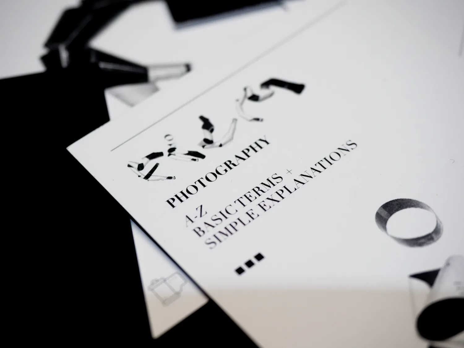
Film photography has a vocabulary that puts beginners off. I organized the terms from A to Z, tested three typefaces, and chose Bodoni. The display alphabet was made by physically distressing letters on Ilford HP5 film. The set includes custom icons for exposure settings and a 2.75 × 4.75 in glue-flap package.
Specimen Comparison: Study 01-03
Helvetica
- Style
Neo-Grotesque
- Why it was considered
High legibility; feels like a technical 1970s camera manual.
- Why it was passed over
Felt too "corporate" and lacked the romanticism of film.
Caslon
- Style
Old Style Serif
- Why it was considered
Traditional and academic; feels like a textbook.
- Why it was passed over
The curves were too soft; it didn't have the "sharpness" of a focused lens.
Bodoni (Winner)
- Style
Didone / Modern
- Why it was considered
High contrast and vertical stress. It mirrors the mechanical precision and "Classic" era of photography.
- Why it won :)
The extreme contrast between thick and thin strokes reflects the play of light and shadow in film.
The distressed alphabet
Letters physically distressed on Ilford HP5 film.
Work in Progress: Captured during the manual distressing phase, documenting the reaction of HP5 emulsion to physical interference.
Final A-Z Alphabet
Dieline & Packaging System
-
Dimensions: 2.75in x 4.75in Professional Card Stock.
-
Hierarchy: Front-facing experimental typography with technical definitions on the reverse.
-
Production: Custom glue-flap packaging designed for durability in the field.
Custom iconography was developed to provide secondary visual cues for exposure settings.